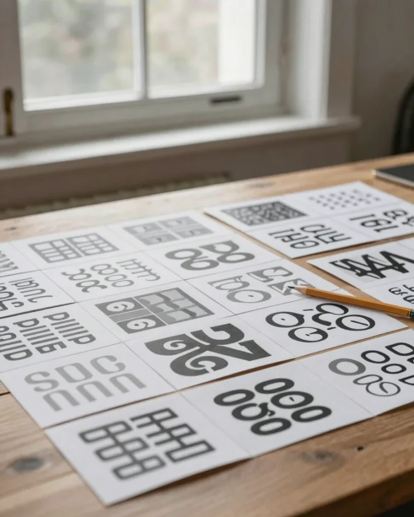
I build visual identities and graphic systems grounded in structural clarity.
Background
A personal studio built on visual integrity
My practice pairs disciplined typography with purposeful material decisions. Each project starts with listening closely to what the work needs to say, then building a clear structure around it.
Collaborations range from emerging independent labels to established cultural projects. I work directly with each client, keeping the process focused and the outcomes considered.
Typography carries the voice of a project. I choose typefaces for their clarity and pair them with a strict hierarchy so every page, poster, or screen reads in the right order.
Production craft matters as much as concept. Print stock, colour separation, and digital responsiveness are considered from the start, so the finished work holds up in the hands of the people who use it.